What should a destination wedding website include so guests feel confident enough to book travel?
Destination wedding websites: everything guests need before they book flights
Read time: 8 minutesThe TL;DR
A destination wedding website isn't just a logistics page, it's the tool that turns "I'll think about it" into a booked flight. The couples whose guests commit earliest are the ones whose websites make the destination feel as covetable as the invitation itself.
Key Takeaways:
Your destination wedding website needs to do two things at once: make guests want to come, and make it easy for them to say yes
There are specific pages and sections that every destination wedding website should have — and most couples only build half of them
The couples with the highest RSVP rates don't have the most thorough websites. They have the most considered ones.

What does a destination wedding website need that a regular wedding website doesn't?
A destination wedding asks more of your guests, and your website is where that ask either feels manageable or overwhelming.
The difference between a destination wedding website and a standard one isn't just the volume of information — it's the stakes of the experience you're designing. When guests are weighing flights, hotels, time off work, and childcare logistics before they can even say yes, your website isn't just a reference document. It's the thing that either builds their confidence or quietly lets their hesitation win. The couples with the highest RSVP rates aren't the ones with the most detailed FAQs. They're the ones whose websites made the whole thing feel worth it before anyone checked hotel availability.
What a destination wedding website needs, above all, is a sense of the experience waiting at the other end. Guests aren't just evaluating logistics, they're evaluating whether this trip is going to be worth the investment of their time, money, and effort. The website is your first and best opportunity to answer that question with something more compelling than just an enticing locale. Below, we'll get into exactly what that looks like in practice — page by page, section by section.
The destination wedding websites guests actually respond to aren't the most thorough ones… they're the most considered ones
There's a version of "comprehensive" that overwhelms, and a version that reassures. Only one of them converts hesitant guests into confirmed ones.
Most destination wedding websites err toward information density: more sections, more details, more contingencies covered. What actually moves guests from uncertain to committed is a website that makes the destination feel like somewhere they already want to be.
Your website is doing two jobs at once and most couples only design for one of them
Logistics builds confidence. Atmosphere builds desire. Guess what – you need both.
The practical information on your destination wedding website matters enormously, but it matters more when it's wrapped in something that makes guests want to show up.
Think about what's actually happening when a guest lands on your website for the first time. They're not in “research mode” yet, they're in “feelings mode.” They're asking themselves, before they've consciously articulated it, whether this trip is going to be an experience or an obligation. The photography you lead with, the tone of your copy, the way the destination is framed, all of it is answering that question before the travel details even load.
Once you've earned their emotional buy-in, the logistics become the thing that seals it. Curated hotel blocks with a clear recommendation about which option is worth the splurge. An honest, specific note about what the destination's weather, culture, or geography requires guests to consider. A timeline that lets people plan their lives around the weekend rather than squeeze the weekend into their lives. This is where practical luxury lives — information delivered with the same care and intention as the rest of the wedding.
The couples who get this right treat the travel section of their website the way a good hotel treats a pre-arrival email: as a hospitality moment, not an administrative one. The goal isn't to answer every possible question. It's to make guests feel genuinely taken care of before they've even packed a bag.
Before any of the logistics land, guests need one thing: a clear sense of the scope. A destination wedding isn't a Saturday. It might be a long weekend, a three-day itinerary, a series of events with different guest lists. Your website should open with a calm, high-level answer to the question guests are quietly asking before they've even found the travel page: what exactly am I committing to here? A simple overview — when to arrive, how long to plan for, what the weekend holds — does more to move guests from "we'll see" to "booking now" than any amount of detail that follows.
If you're still working out what your site should look like structurally, our services page walks through how we approach this for every client.
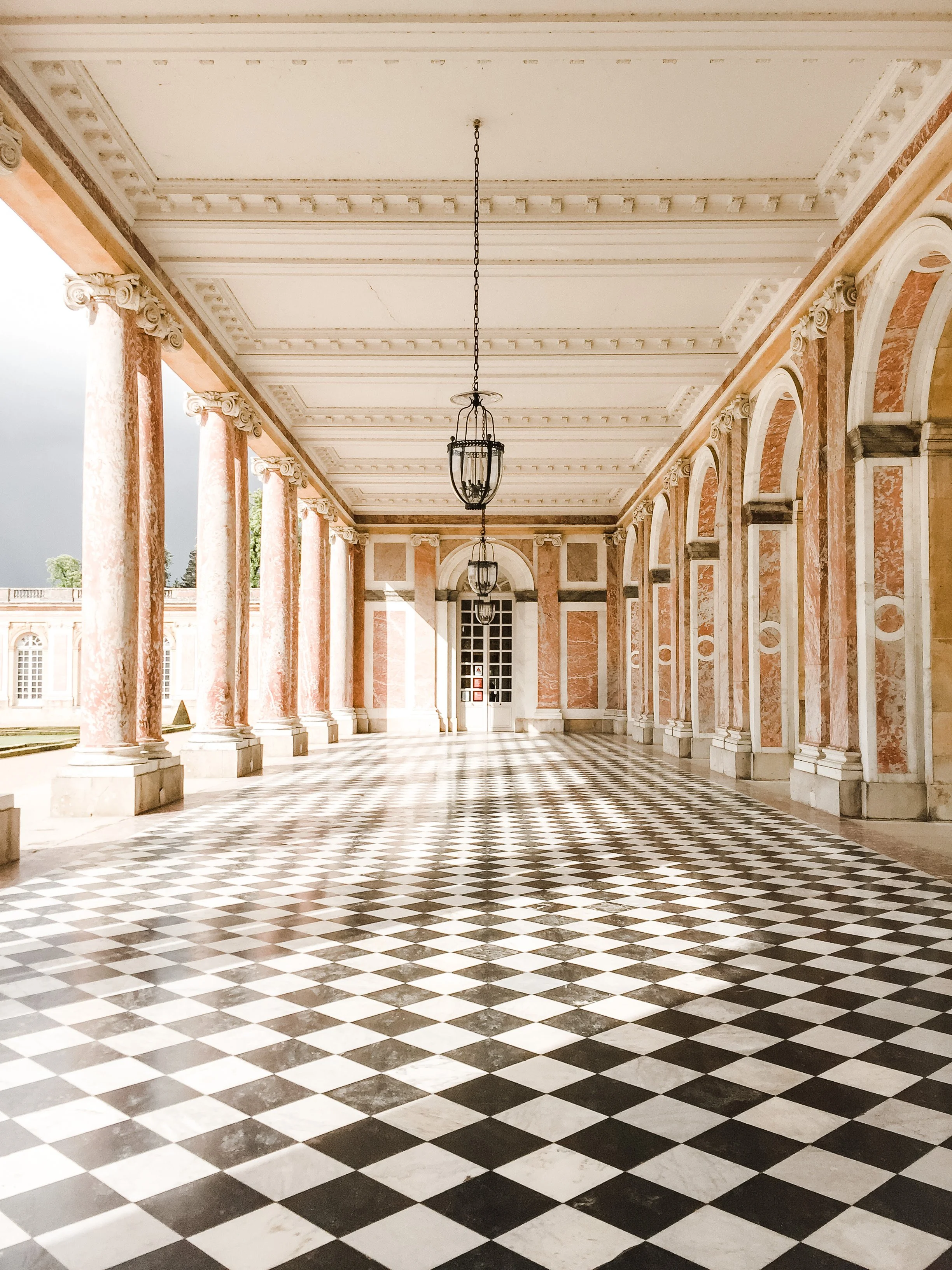
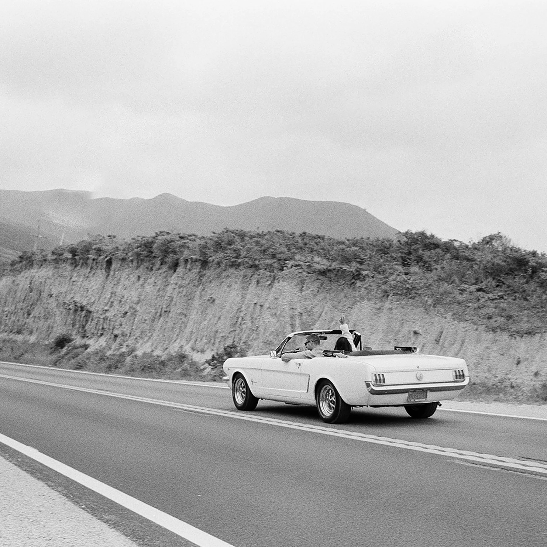
The best destination wedding websites don't just inform guests — they make the destination feel like a place guests are excited to visit.

The pages your destination wedding website actually needs (and what most couples forget)
Think of these less as sections and more as hospitality moments
A curated accommodation section is almost always the first place guests go. Not just a hotel name and a link — a brief, genuine note about why you chose it. Proximity to the venue, the atmosphere, whether it's worth upgrading. One honest recommendation does more work than a list of five options.
Travel logistics come next, and this is where vagueness costs you RSVPs. Nearest airports, transfer options, approximate journey times, whether a hire car is worth it. Not exhaustive, but enough that a guest flying in from another country doesn't have to open three other tabs to figure out how to get there.
A clear events schedule is non-negotiable for multi-day celebrations. Every event — welcome dinner, ceremony, brunch, anything in between — with its own date, time, location, and dress note. Guests need to plan their lives around your weekend. Make it easy for them.
A local guide is the section guests return to most, and the one that transforms the website from a logistics document into something they're actually excited to read. Curate it like a recommendation from a friend who's been there: three restaurants, two views, one walk. Not a travel blog, just enough to make the destination feel like somewhere they already want to explore.
Don't forget the things guests don't know to ask. Dress codes specific to the climate, whether cobblestones rule out certain footwear or the local currency is easier in cash. A light practical note framed as insider knowledge rather than a disclaimer. Quick. Considered. Exactly the kind of detail that makes guests feel genuinely looked after.
How the design of your destination wedding website shapes the experience of the whole weekend
Visual cohesion across your website, invitations, and day-of materials tells guests this weekend was built for them
A destination wedding is a branded experience, whether you design it that way or not. The question is whether that brand is working for you.
When a guest receives your invitation suite, visits your website, opens their hotel room door to a welcome gift, and sits down to your wedding night dinner with perfectly printed menus that all speak the same visual language, they experience the weekend as a whole, curated thing. That's not an accident of good taste, but the result of treating every touchpoint as part of the same design system. For destination weddings specifically, where guests are living inside your world for multiple days, that coherence is felt more acutely than at any single-day event.
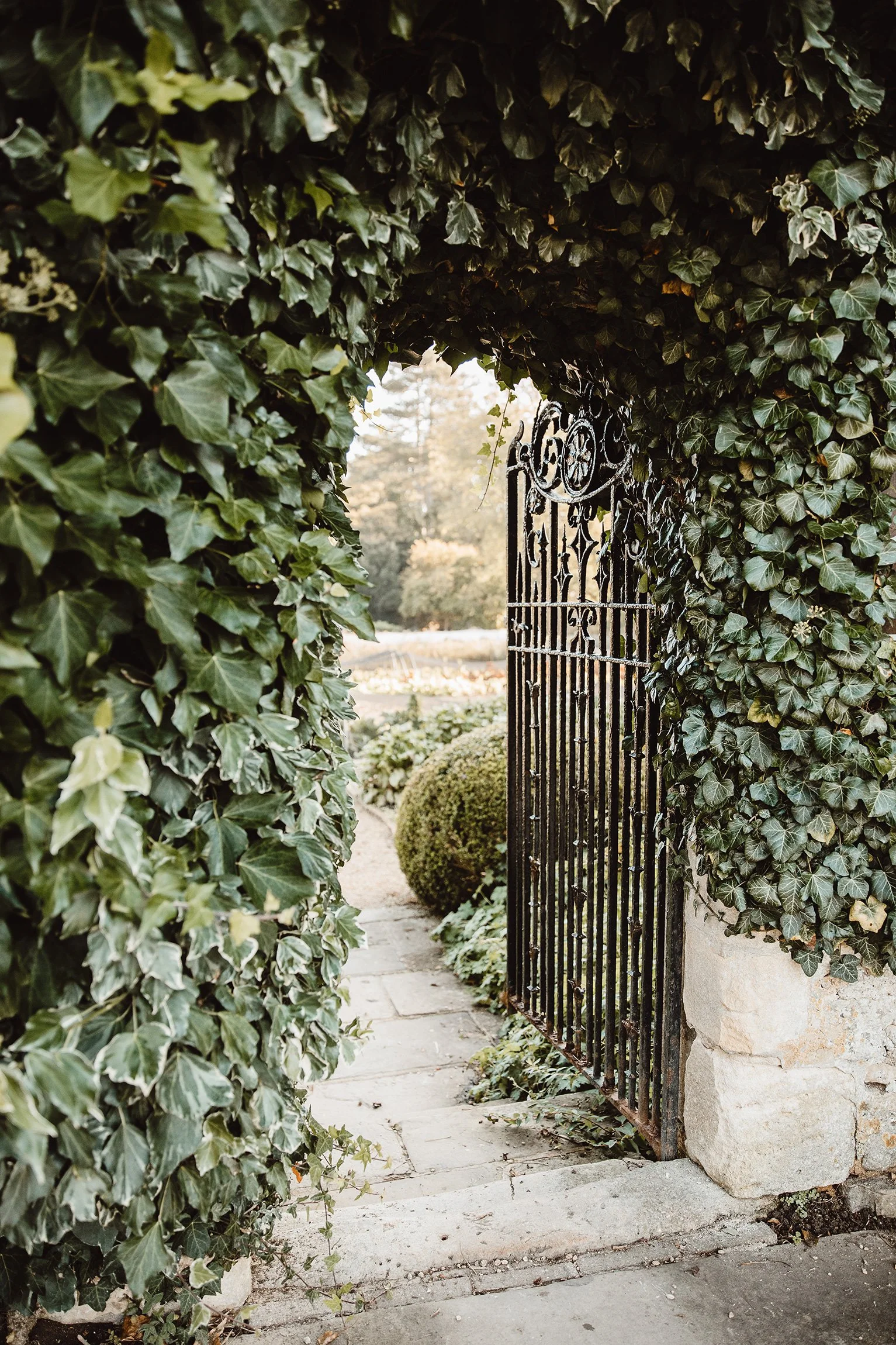
The destination itself is part of your visual identity. A wedding on the Amalfi Coast, a vineyard in Sonoma, or an island in the Bahamas each carries its own atmosphere. And your website should be translating that atmosphere into the design choices guests encounter before they arrive. Typography that echoes the locale. Photography that's editorial rather than documentary. Color drawn from the landscape rather than a Pinterest board built in a vacuum. This is design intelligence applied to a specific context, and guests feel the difference even if they can't name it.
The couples who get this right aren't just thinking about their website in isolation — they're thinking about the full arc. From the moment the save-the-date lands to the moment guests step off the plane, every touchpoint is either reinforcing the experience or quietly undermining it. A destination wedding website that matches the design intelligence of the rest of the wedding isn't an add-on. It's the first chapter. It's also, incidentally, one of the most under built parts of the wedding. If you're curious what that looks like when it's done well, this is a good place to start.

Your guests are making a real commitment to be there — your website should make them feel like it's worth it
The blueprint for doing this well already exists. You don't have to figure it out from scratch.
A destination wedding asks a lot. Flights, hotels, time off, logistics your guests are quietly solving before they've even replied. The website is the first signal that the experience on the other end is worth all of it. Not a permission slip, not a logistics doc, but a preview of something they're already glad they said yes to.
If you want a structured starting point for building a destination wedding website that does both jobs well — the logistical and the atmospheric — The BTO Blueprint is where to begin. It's the framework we use to make sure nothing important is forgotten. Download your complimentary copy today.
FAQs
Frequently Asked Crudités
-
Earlier than you think, ideally the moment save-the-dates go out, which for destination weddings is typically 12 to 18 months before the event. Guests need a significant lead time to book travel, request time off, and sort childcare or pet care. The website going live alongside the save-the-date gives guests somewhere to land immediately, while the anticipation is highest and the calendars are still open.
-
Beyond flights and hotels, the most useful destination wedding websites cover the things guests don't know to ask: dress codes specific to the climate, whether the ceremony is on cobblestones, local currency, any cultural context that matters. Frame it as insider knowledge rather than a disclaimer and guests will actually read it.
-
Yes, and it's worth treating that page with the same design care as the rest of the site. A dedicated travel section signals to guests that their logistics have been thought through, not appended. It also makes the practical information easier to find on return visits, which guests will make multiple times as their plans take shape. Burying travel details inside a general FAQ is one of the most common ways destination wedding websites create friction without realizing it.
-
Lead with atmosphere, not administration. The first thing guests encounter on your website should make the destination feel like a place they already want to be: through photography that's been chosen for mood, copy that's written with personality, and a design that reflects the locale rather than defaulting to whatever the platform suggests. The logistics can follow. But if guests don't feel something in the first scroll, the details won't do the work you need them to do.
Hey there, I’m Maud!


I accidentally became the go-to Expert
for creating above-average wedding websites as the party-planning-loving tech girlie in the friend group. In the span of a {decidedly socially busy} year, I had friends popping up left and right for advice on how to create a wedding website that didn’t totally suck. Thinking I could find something better for them as a pro web designer, I searched the whole dang world wide web and came up with… nada. Zilch.
So I built them custom sites harmonizing with their invitation suites and themes.
Realizing lots of couples were stuck in the same spot without a web design buddy to tap in — I knew what I had to do: launch a wedding website shop! (Say that five times fast.) Now I help couples achieve the elevated details, privacy, and stress-free support they deserve.


The BTO Blueprint
Ready to discover the stress-free way to build a wedding website that matches your vibe and keeps guests out of your inbox?
Enter your best email here & you’ll snag a free copy of my new checklist with all the details you’ll need to launch a perfect site.
Explore the Edit