How do I make sure my wedding website matches my invitations and overall wedding aesthetic?
How we work with your wedding planner and stationer to keep every touchpoint cohesive
Read time: 6 minutesThe TL;DR
Visual cohesion across a wedding doesn't happen by accident — it happens when the people designing each piece of the puzzle are actually talking to each other. Here's what that collaboration looks like in practice, and how it changes the experience for everyone involved.
Key Takeaways:
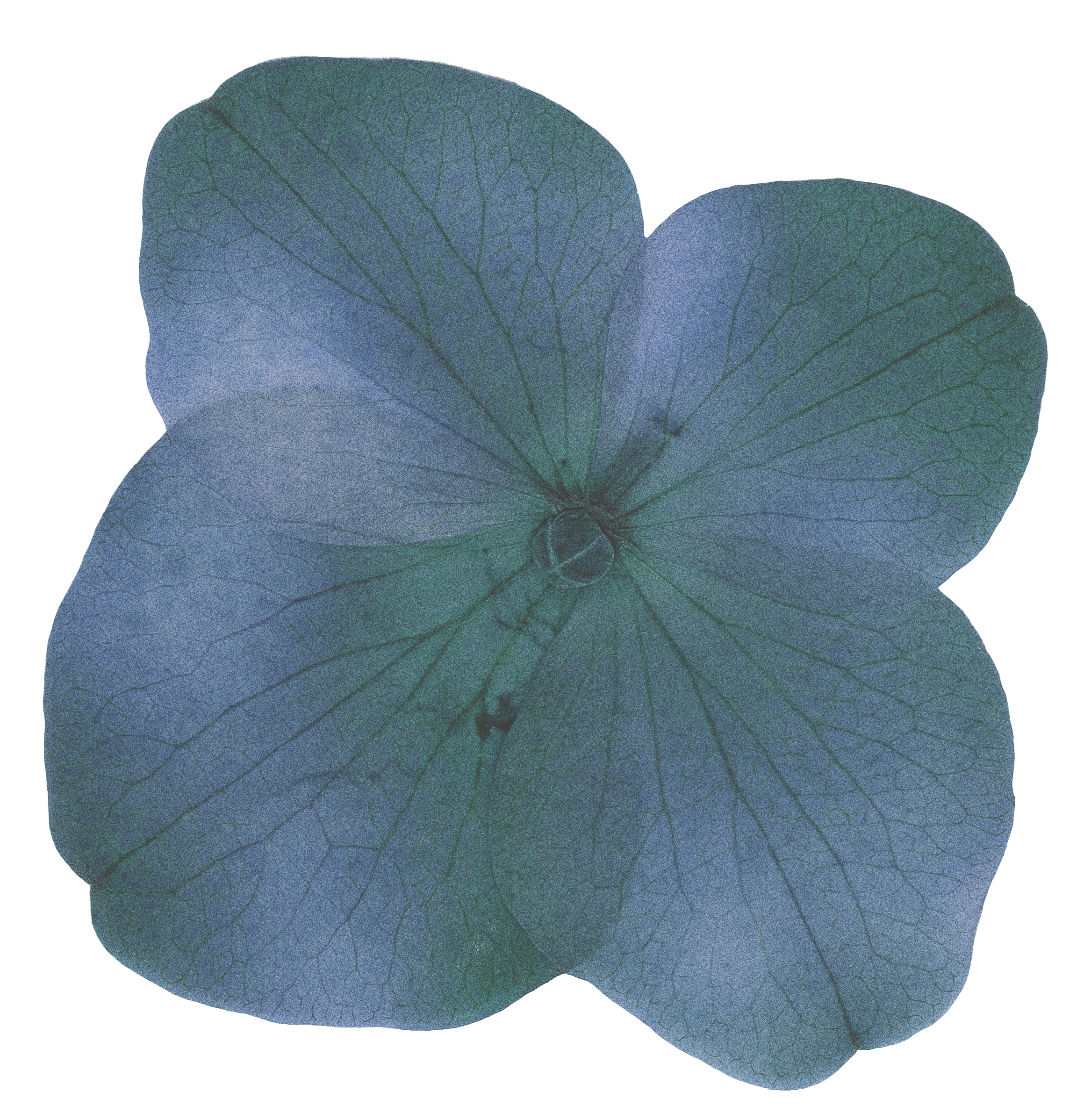
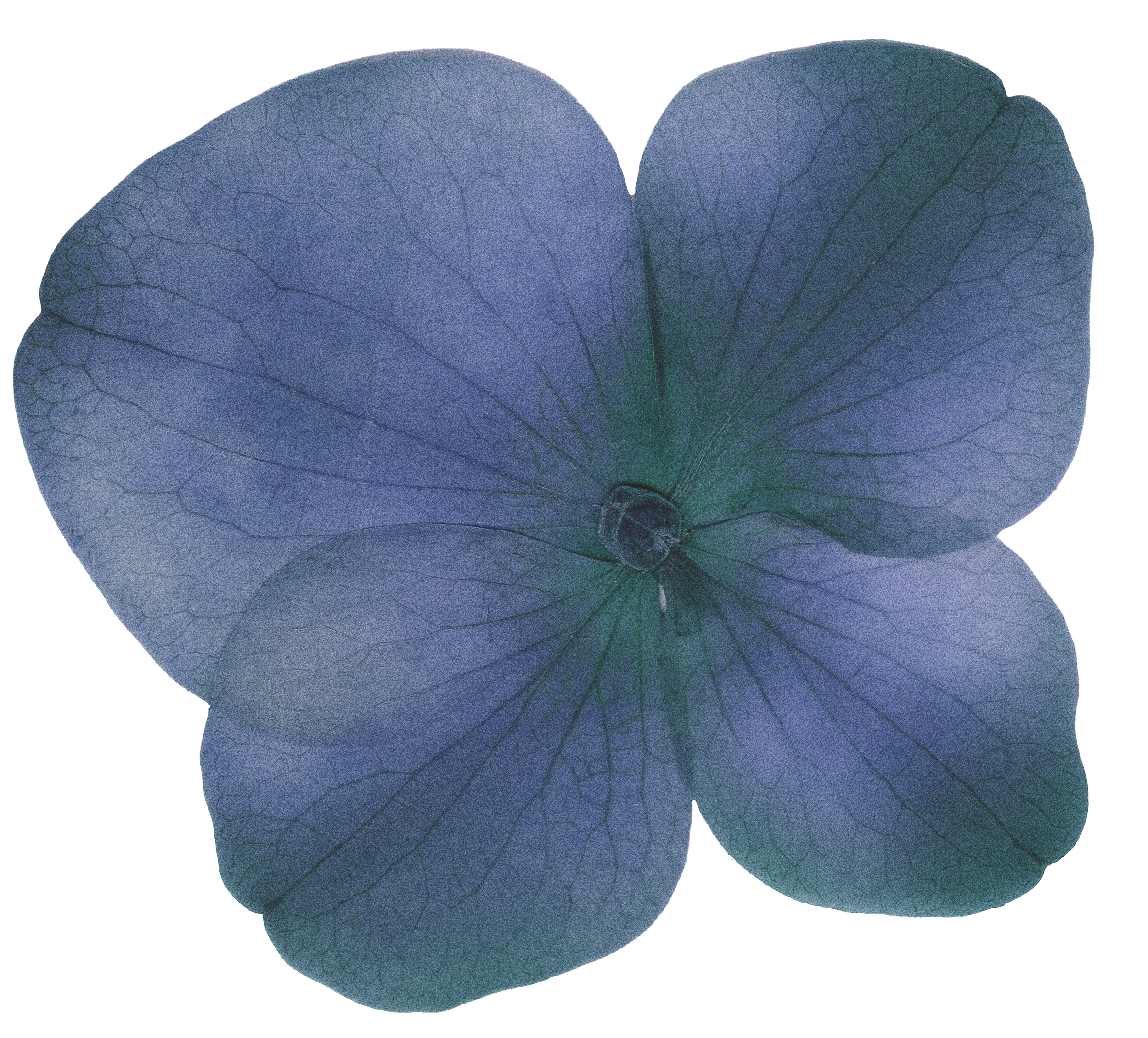
A wedding website that matches your invitation suite isn't a nice-to-have, it's the difference between a wedding that feels designed and one that feels assembled
Collaboration between your website designer, planner, and stationer isn't complicated, it’s intentional
When every vendor is working from the same visual brief, guests feel the coherence without being able to name it
How do you make sure a wedding website matches the rest of the stationery and design?
The visual identity of a wedding isn't owned by any single vendor, it lives in the space between all of them.
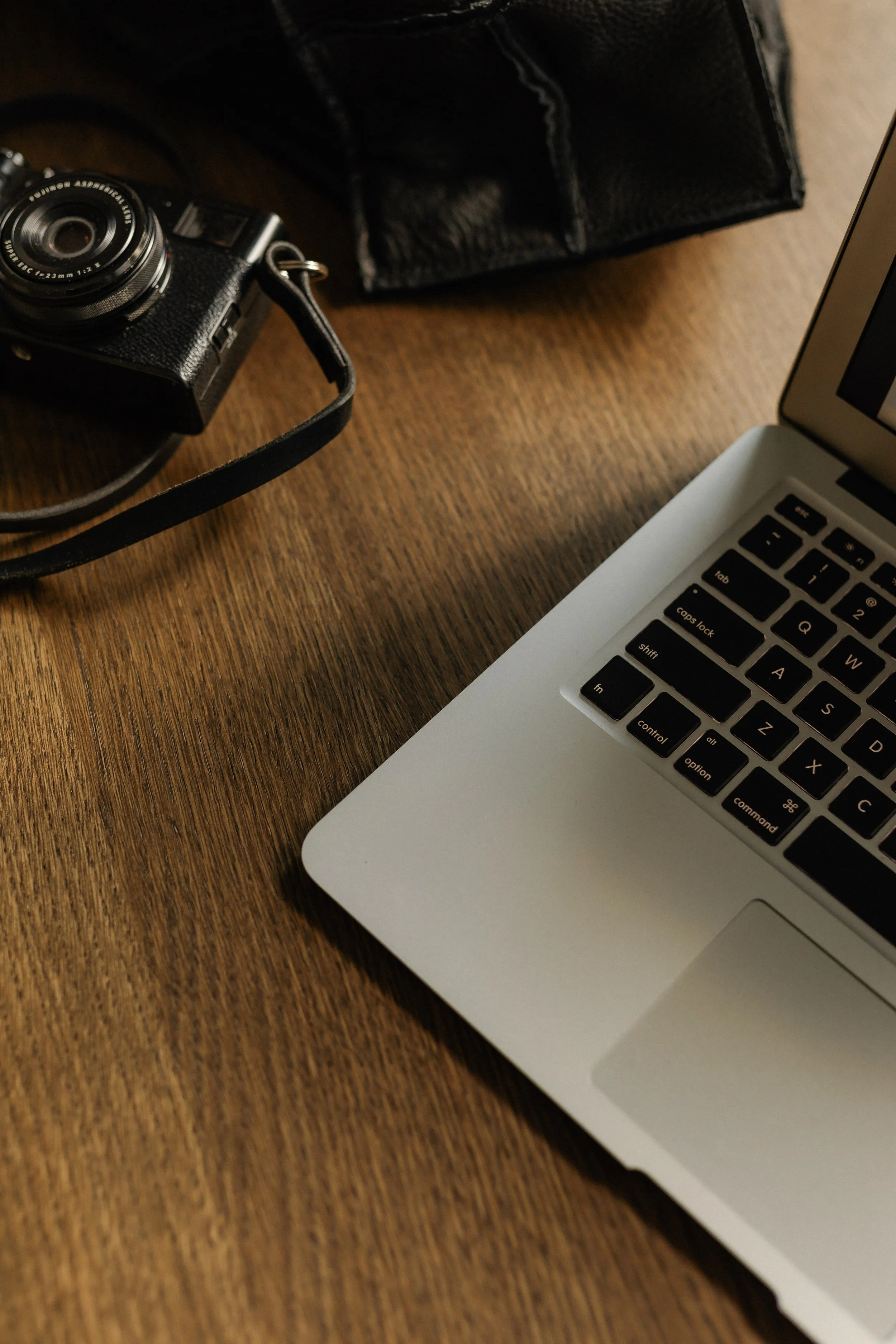
Most couples build their wedding in layers: the planner first, then the stationer, then the website, then the signage, each piece handed off to a different specialist working largely in isolation. Sometimes the result is a wedding that has beautiful components that don't quite cohere. Maybe an invitation suite has one typographic personality and a website borrows a different one from a big-box platform's dropdown menu. No single piece is wrong. But nothing’s singing harmoniously, either.
A wedding website that matches your stationery isn't a technical problem — it's a timing one. When we're brought in early, we work from the same visual brief your stationer and planner are already using. Same fonts. Same palette. Same register. Nothing gets retrofitted because nothing was ever designed in isolation.
The weddings that feel the most elevated aren't the most expensive ones — they're the most coherent ones
Cohesion is a feeling guests have before they can explain why
When a guest receives your invitation, visits your website, and arrives to find signage that all speak the same visual language, they experience your wedding as a whole, deliberate experience. That feeling of intentionality is designed, not stumbled upon.
What collaboration actually looks like and why it starts earlier than most couples expect
The brief that holds everything together
The most important document in an elevated wedding design process isn't necessarily the contract, but the creative brief, and most weddings don't have one.
A creative brief isn't a mood board. It's a set of shared decisions about palette, typography, photographic direction, and tone of voice that every vendor on the design side of your wedding can work from independently and still arrive at something cohesive. When we collaborate with your stationer and planner, this is the first thing we establish or ask to be brought into. It's what allows a custom wedding website to feel like a natural extension of the invitation suite rather than a separate project that happened to share the guest list.
In practice, this means a conversation that happens early, before the website structure is built, before the template is chosen or the custom design is envisioned. We ask to see the stationery direction. We ask the planner to loop us in on the logistics that shape the design: venue atmosphere, the emotional register of the weekend, and any details that need to be communicated before guests arrive. The goal is a shared creative language. One clear point of view, held consistently across every touchpoint.
When this works, what couples notice is that the process feels unusually calm. There's no retrofitting or last-minute scramble when someone realizes a detail doesn’t match. The design decisions have already been made together before anything goes to print or goes live.

Cohesion isn't about everything matching — it's about everything belonging to the same vision.

What guests feel when the collaboration works and what they notice when it doesn't
Every touchpoint is a vote for or against the experience you're trying to create
Guests don't audit a wedding's visual consistency: they absorb it and feel the difference.
Picture it: a guest opens an envelope and holds an invitation with a particular typographic personality — a specific weight, a particular colour, a certain quiet confidence on the page. Then they visit the website. And it's the same world. Same tone. Same register. They don't think "oh, the design matches." They just feel like they already know this wedding. That's the collaboration working.
When a guest moves through a wedding where every touchpoint has been designed in conversation with the others, the experience has a quality that's difficult to articulate but immediately recognizable: it feels like it was meant to be exactly this way. The invitation prepared them for the website. The website prepared them for the ceremony. None of it required explanation because the design was doing all the orienting work. That's guest experience elevated to its highest function, hospitality that operates above the level of conscious thought.
The inverse is equally true and felt. A wedding where the stationery, website, and day-of materials are each beautiful in isolation but disconnected from each other creates a subtle but persistent sense of dissonance. Guests can't name it, but they feel it — the same way you feel when a room has furniture that doesn't quite go together. The intention isn't visible. For couples who have put real thought into every other layer of their wedding, this is the gap worth closing.
This is also why the collaboration between vendors matters beyond aesthetics. When we're working in active conversation with your planner, we're designing a website that reflects the actual shape of your weekend — the flow, the tone, the things guests genuinely need to know before they arrive. And when we're aligned with your stationer, the website doesn't just match the invitation. It extends it. Guests feel like they've been handed the next chapter of the same story.
Your wedding deserves vendors who are actually talking to each other and a website that shows it
This is what the process looks like when it's working the way it should
The couples whose weddings feel the most considered aren't the ones who spent the most — they're the ones who made sure the people building each piece of the experience were working from the same vision. That coordination doesn't happen automatically. It happens when someone is holding the thread.
If you're planning a wedding where every detail has been considered and you want the website to show it — the custom design inquiry is where we start. Tell us about your wedding, and let's make sure nothing gets left behind.
FAQs
Frequently Asked Crudités
-
Not always — but when they do, the difference is noticeable. At minimum, your web designer should be working from the same visual references your stationer used: the palette, the typefaces, the general aesthetic direction. At best, there's a direct creative handoff where the stationery design informs the website design, and both feel like they came from the same mind. That second version is the one guests feel.
-
The more context, the better, but start with your stationery files or proofs, your venue photography, and any existing mood boards or creative direction your planner or stationer has already developed. If you have a visual brief or a defined palette, bring that too. The goal is to give your website designer the same creative input your other vendors are working from, so no one is designing in a vacuum.
-
The most effective approach is a shared creative brief: a single document that defines the aesthetic direction, palette, typography references, and tone of the wedding that every design-side vendor works from. Your planner is often the right person to hold and distribute this, but it can also originate from the stationer or the website designer, depending on who comes into the process first. The brief doesn't need to be elaborate. It just needs to be shared.
-
For a custom wedding website design developed in coordination with your stationer and planner, six to nine months before the wedding date is the right window to begin. That gives enough lead time to align with your other vendors before anything is finalized, incorporate the stationery direction before the site is built, and leave room for thoughtful revisions rather than rushed ones. The earlier the conversation starts, the smoother the outcome.
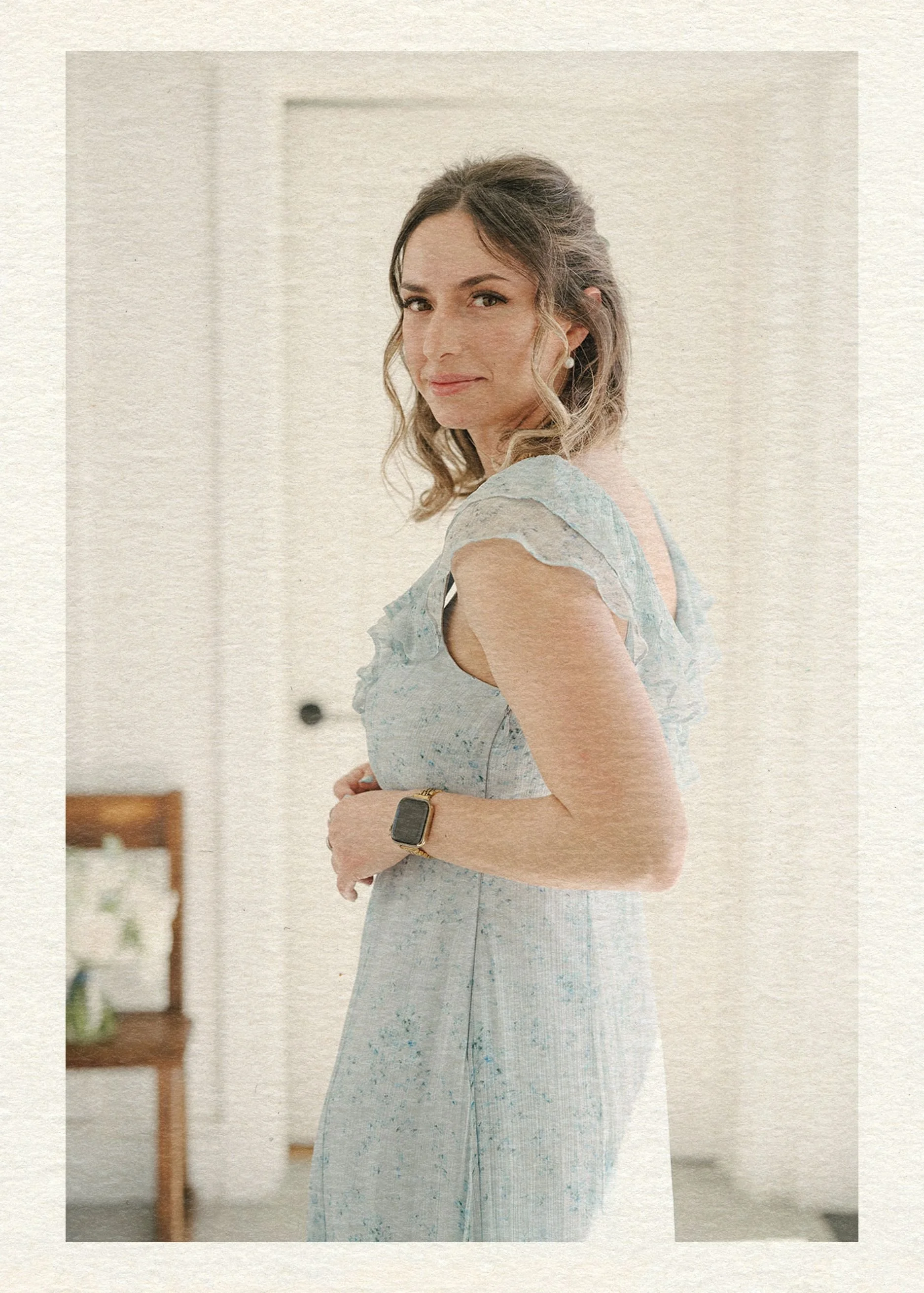
Hey there, I’m Maud!
I accidentally became the go-to Expert
for creating above-average wedding websites as the party-planning-loving tech girlie in the friend group. In the span of a {decidedly socially busy} year, I had friends popping up left and right for advice on how to create a wedding website that didn’t totally suck. Thinking I could find something better for them as a pro web designer, I searched the whole dang world wide web and came up with… nada. Zilch.
So I built them custom sites harmonizing with their invitation suites and themes.
Realizing lots of couples were stuck in the same spot without a web design buddy to tap in — I knew what I had to do: launch a wedding website shop! (Say that five times fast.) Now I help couples achieve the elevated details, privacy, and stress-free support they deserve.
The BTO Blueprint
Ready to discover the stress-free way to build a wedding website that matches your vibe and keeps guests out of your inbox?
Enter your best email here & you’ll snag a free copy of my new checklist with all the details you’ll need to launch a perfect site.
Explore the Edit