Why does my wedding website look like everyone else's — and how do I fix it?
The real reason most wedding websites look the same — and how to break out of it
Read time: 6 minutesThe TL;DR
Most wedding websites look identical because the platforms that build them are optimizing for user volume, not personal expression. Unique wedding website design isn't about doing more — it's about designing with intention instead of accepting platform defaults. Most couples don't know another option exists.
Key Takeaways:
The sameness isn't an accident. It's what template platforms are built to produce
A wedding website that looks like everyone else's is quietly telling guests something you probably didn't mean to say
There's a path between cookie-cutter and fully custom — and it starts with knowing one exists
Why do so many wedding websites look alike… and does it actually matter?
The sameness is a feature, not a bug. At least from the platform's perspective.
Wedding website platforms are built for volume. Their goal is to make it possible for any couple, regardless of design experience, to have something functional and presentable live within an hour. That's a genuinely useful thing. But the output of that goal is a landscape of wedding websites that share the same font pairings, the same layout logic, the same hover states because they're all drawing from the same well of safe, broadly acceptable design choices.
Here's the thing: it matters the second your guests click the link. If your wedding has a point of view, a feeling you've been building across every single decision, a website that could belong to anyone is quietly undercutting all of it before a single guest enters your reception.
Unique wedding website design isn't out of reach, it just requires one question the platforms never ask you
Most couples don't want generic. They just don't know a choice exists.
Wedding website platforms are designed for mass adoption, not individual expression. They're optimizing for “anyone can do this in an hour,” which is genuinely useful, until you realize the tradeoff is a site that looks exactly like your best friend's, your coworker's, and the thousand other strangers getting married the same weekend. The problem isn't the template. It's that nobody stopped to ask if it was right for you specifically.
What your wedding website is communicating before anyone reads a word
Design is never neutral and your guests are already forming an opinion
Every design decision is a signal, whether you made it intentionally or not.
When a guest clicks your wedding website, they're not just looking for information — they're building a picture. The typography, the palette, the way the photography is cropped and sequenced, the tone of the copy — all of it is telling them what kind of wedding this is going to be. A website that feels polished and considered says the same thing your invitation suite says: that someone thought carefully about every layer of this event. A website that feels generic says something too, even if you didn't mean for it to.
This is the part that catches most couples off guard. They've been meticulous about the flowers, the menu, the tablescape… and then handed guests a first impression that reads like a placeholder. Not because they don't care, but because no one framed the website as a design decision worth caring about.
Guest experience doesn't begin at the venue. It begins the first time someone engages with anything that belongs to your wedding, and for most guests, that's the website. The emotional arc you want them to feel on the day itself has to start somewhere. Don’t leave it up to your stationery to do the heavy lifting solo. That's where intentional design comes in. And it doesn't have to mean starting from scratch.
A website that could belong to any wedding belongs to none of them — including yours.
How unique wedding website design actually works and what it looks like in practice
Breaking out doesn't mean starting from scratch — it means starting with a point of view
The couples whose wedding websites actually stand out aren't doing more, they're making decisions instead of accepting defaults.
Intentional design at the website level looks like choosing typography that echoes your invitation suite rather than whatever the platform defaults to. It looks like sequencing your photography so the first image sets a mood, not just fills a space. It looks like writing copy that sounds like you, not like a generic template. None of that requires a complete custom build. It requires treating the website as part of the wedding's visual identity, not an afterthought that happens to share important details.
The distinction between a template and a custom design isn't really about complexity; it's about whether the design was made for your wedding specifically. That's what bespoke design looks like when it's done right and why the result feels so different. A well-executed template with a clear point of view will outperform a custom site that was built without one. The template is a tool. The point of view is the work. What most couples are missing isn't access to better tools; it's the framing that the website is somewhere worth putting a point of view in the first place.
When the website, the stationery, the signage, and the day-of materials all speak the same visual language, something shifts for guests — they stop experiencing the pieces separately and start experiencing the wedding as a whole, deliberate experience. That coherence is what people mean when they say a wedding felt elevated. It's rarely one single element. It's the through-line.
Ready to see what's possible? Explore the templates — or if you want something built entirely around your wedding, start here.
Your wedding has a point of view. Your website should too.
The default is easy. But intention is what guests remember.
You didn't choose your venue because it was the first one available. You didn't pick your florals because they were the most common option. The same instinct that drove every other decision you've made? It applies here, too. If you're ready to see what's possible — whether that's a template that actually carries your point of view or a fully custom build — our services page is the place to start. Come with your references. We'll take it from there.
FAQs
Frequently Asked Crudités
-
Start with your visual identity, not the platform's defaults. That means bringing in typography, color, and photography choices that are already showing up in your invitation suite or inspiration board, rather than building the website in isolation. The couples whose sites feel most distinctive are the ones who treated the website as part of a larger design system, not a separate task.
-
Restraint, consistency, and typography. Overloaded layouts, mismatched fonts, and stock-feeling photography are the fastest ways to flatten a site that could otherwise feel elevated. A clean hierarchy, a cohesive palette, and photography that properly reflects the wedding's atmosphere will do more for the perceived quality of a design than any feature the platform offers.
-
Yes, and not just aesthetically. Your invitations and your website are both introducing guests to the same wedding, and when they speak the same visual language, the cumulative effect is cohesion that reads as intention. When they don't match, even subtle misalignment creates a gap that guests feel without being able to name it.
-
It depends on what your wedding is trying to communicate. For couples with a strong visual identity who want every touchpoint to reflect that, custom design is the clearest path to a site that actually feels like theirs. For couples who want something beautiful and considered without a fully bespoke process, a well-designed template with a clear point of view applied can accomplish a great deal. The question worth asking isn't "can I afford custom?" it's "does the default actually represent what I want?"
-
A custom site is built entirely around your wedding's visual identity — typography, layout, color, imagery — from scratch. A template gives you a professionally designed foundation that you adapt to your aesthetic. The right choice depends less on budget and more on how specific your vision is and how much you want it reflected in every detail.
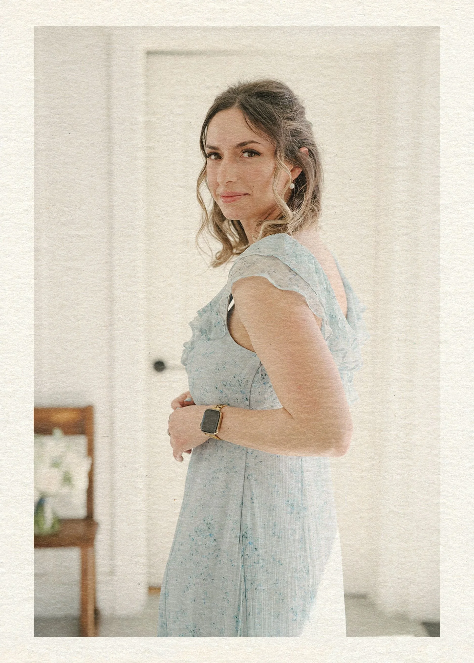
Hey there, I’m Maud!
I accidentally became the go-to Expert
for creating above-average wedding websites as the party-planning-loving tech girlie in the friend group. In the span of a {decidedly socially busy} year, I had friends popping up left and right for advice on how to create a wedding website that didn’t totally suck. Thinking I could find something better for them as a pro web designer, I searched the whole dang world wide web and came up with… nada. Zilch.
So I built them custom sites harmonizing with their invitation suites and themes.
Realizing lots of couples were stuck in the same spot without a web design buddy to tap in — I knew what I had to do: launch a wedding website shop! (Say that five times fast.) Now I help couples achieve the elevated details, privacy, and stress-free support they deserve.
The BTO Blueprint
Ready to discover the stress-free way to build a wedding website that matches your vibe and keeps guests out of your inbox?
Enter your best email here & you’ll snag a free copy of my new checklist with all the details you’ll need to launch a perfect site.
Explore the Edit