What's the difference between a wedding website and a wedding invitation — and what belongs on each?
Wedding website etiquette: what belongs online, what stays on the invite, and what remains private
Read time: 6 minutesThe TL;DR
Your wedding website isn't a digital filing cabinet — it's the first experience your guests have of your event. Knowing what belongs online, what lives on the invite, and what stays completely private is the difference between a cohesive experience and a chaotic one.
Key Takeaways:
Your wedding website is a guest experience tool — structure it like one
Invitations signal what matters most; websites carry the depth and logistics
Privacy isn't an afterthought — it's a design decision, and most free platforms don't make it for you
Why does it feel like your wedding website is doing too much and your invitation not enough?
The fastest way to overwhelm your guests is to treat your wedding website like a storage unit for information. When everything is included, nothing feels important, and your guests are left scanning instead of absorbing.
A well-structured wedding website mirrors the experience you’re trying to create in real life. It builds anticipation, answers the right questions at the right time, and quietly signals that every detail has been considered.
Your website and your invitation aren't competing — they have different jobs. One signals importance. The other handles depth. Get that wrong and the whole thing feels cluttered, even if each piece is beautiful on its own.
Your wedding website is the first experience your guests have — before they RSVP, before they book travel, before they arrive
Most couples think about what to include, when the better question is what experience you're designing
Guests interact with your wedding long before they arrive at the venue. The website is where that experience begins, and how it's structured tells them everything about what kind of event they're about to attend.
What actually belongs on a wedding website (and why most couples include too much)
Think of your website as a concierge, not a binder

Your wedding website should hold the information that benefits from context and flexibility. Travel details, accommodations, weekend schedules, and RSVP flows all live here because they evolve and expand beyond what paper can hold.
The key is not volume, it’s clarity. Guests should land on your site and intuitively know where to go next, what matters most, and what action they need to take. This is where strong design intelligence shows up, not in decoration, but in decision-making.
If you’re building from a template, this is often where things fall apart. Templates encourage inclusion over intention. A custom or strategically edited approach ensures every section earns its place.

A good wedding website doesn’t answer every question, it answers the right ones at the right moment


What stays on the invitation and why restraint signals importance
Your invitation isn't competing with your website, it's the anchor
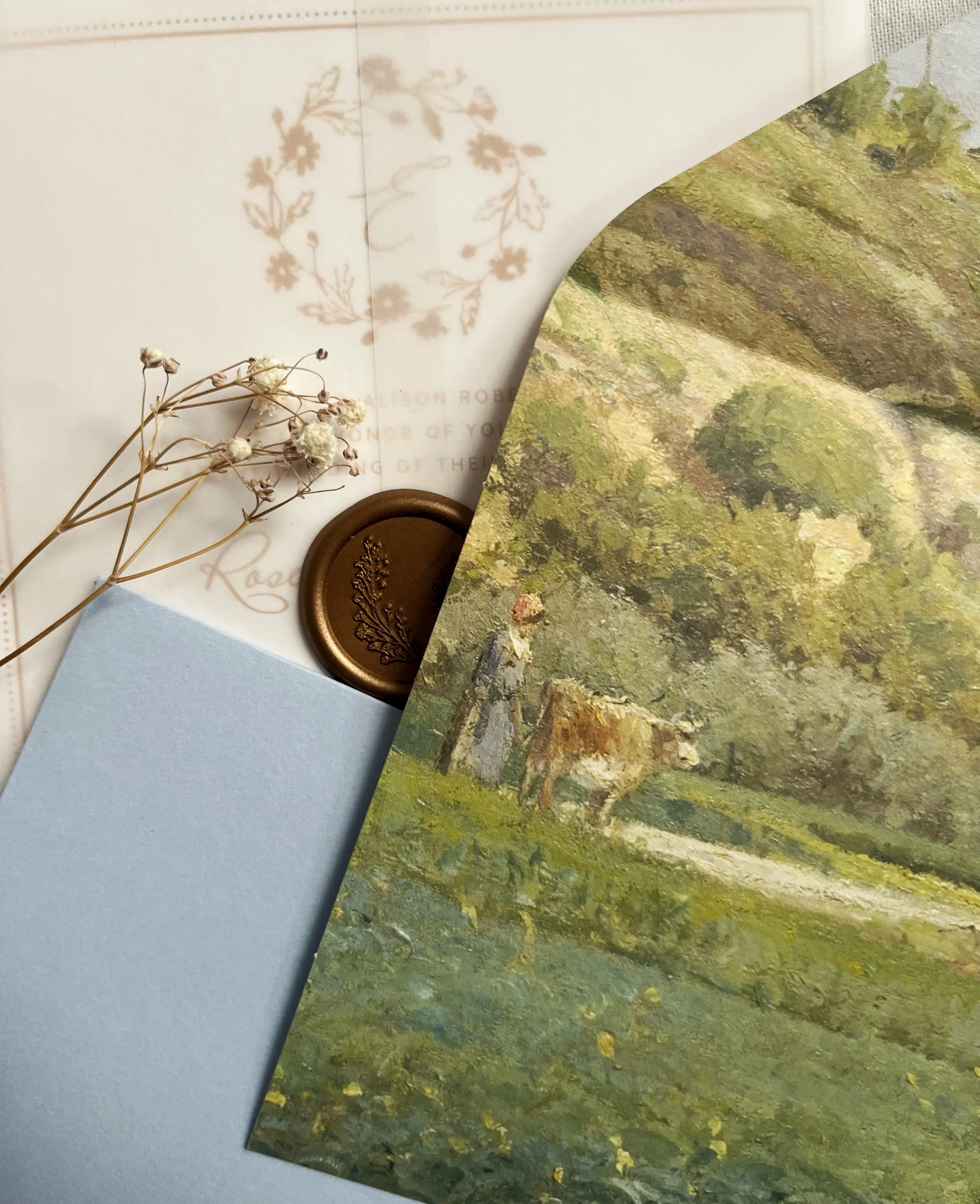
Your invitation suite exists to establish tone, not carry logistics. Date, location, and essential details belong here because they signal what matters most and deserve permanence.
When invitations try to do too much, they dilute their own impact. Overloading them with inserts, directions, and registry details shifts the experience from considered to cluttered.
There is also a brand conversation happening here. When your invitation and website feel disconnected, guests notice, even if they can’t articulate why. Cohesion across both touchpoints creates a sense of effortlessness that reads as luxury.

Here's what intentional wedding website etiquette actually does for your guests and for you
The difference between informed guests and immersed guests
When the structure is right, your guests arrive already in the experience. They're not scrambling for parking details the morning of — they're anticipating. They're excited. That's what good wedding website etiquette actually creates. Before you build (or rebuild) your site, get clear on what needs to exist. The BTO Blueprint walks you through exactly that: what to prepare, what to protect, and what to cut. Download a free copy here.
FAQs
Frequently Asked Crudités
-
Personal or sensitive information like detailed family dynamics, registry pressure language, or anything that could create discomfort should stay offline.
-
Yes, because they serve different roles. Invitations establish importance and tone, while the website supports logistics and ongoing updates.
-
If a guest has to search or reread to find what they need, it’s too much. Clarity and hierarchy matter more than completeness.
-
For most couples, yes — especially for high-profile or private weddings. Password protection keeps your personal details, venue information, and guest list off the public internet. It's one of the clearest signs of a thoughtfully designed site.
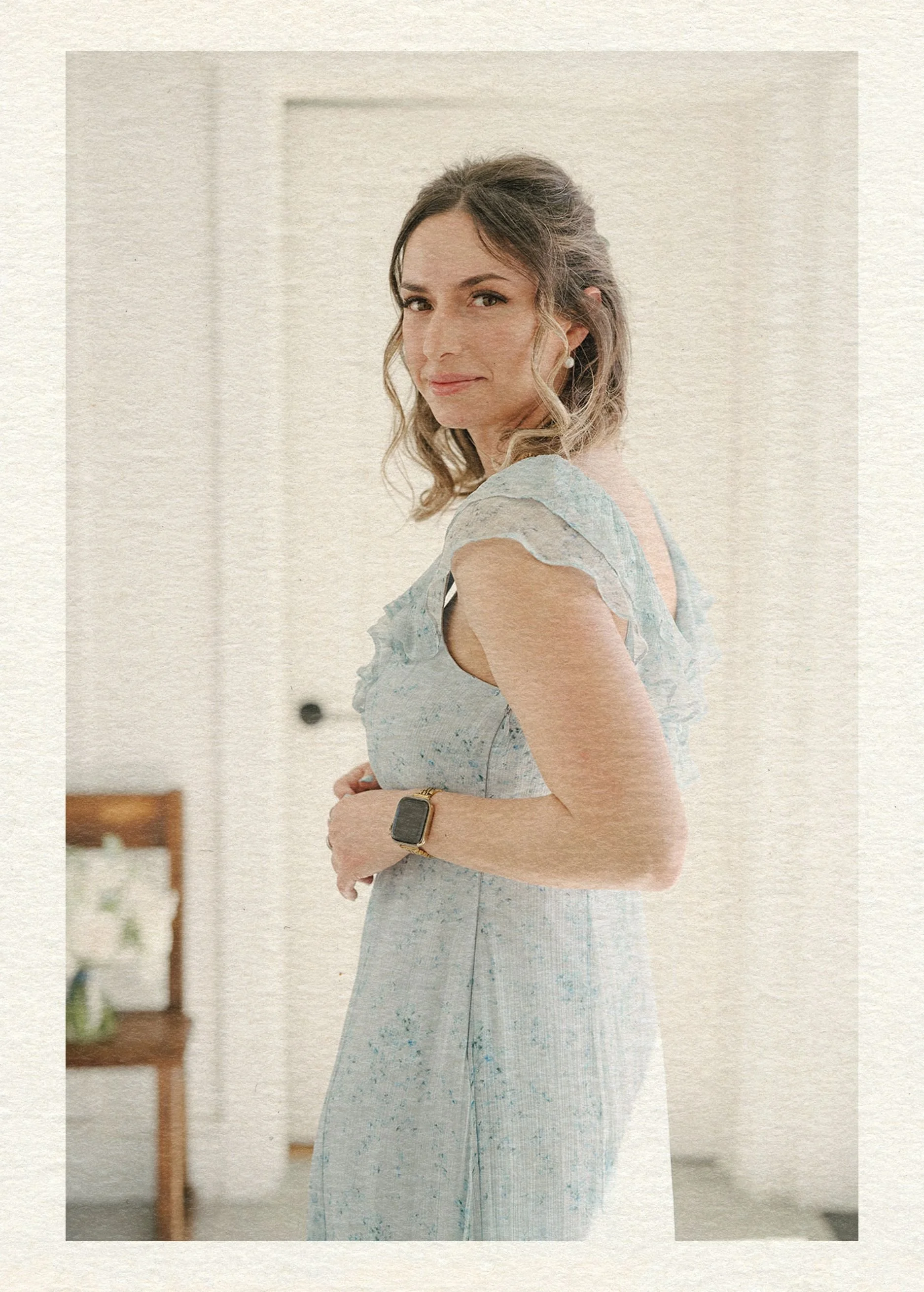
Hey there, I’m Maud!


I accidentally became the go-to Expert
for creating above-average wedding websites as the party-planning-loving tech girlie in the friend group. In the span of a {decidedly socially busy} year, I had friends popping up left and right for advice on how to create a wedding website that didn’t totally suck. Thinking I could find something better for them as a pro web designer, I searched the whole dang world wide web and came up with… nada. Zilch.
So I built them custom sites harmonizing with their invitation suites and themes.
Realizing lots of couples were stuck in the same spot without a web design buddy to tap in — I knew what I had to do: launch a wedding website shop! (Say that five times fast.) Now I help couples achieve the elevated details, privacy, and stress-free support they deserve.


The BTO Blueprint
Ready to discover the stress-free way to build a wedding website that matches your vibe and keeps guests out of your inbox?
Enter your best email here & you’ll snag a free copy of my new checklist with all the details you’ll need to launch a perfect site.
Explore the Edit